HTML5 classList API

html5 classList

DOM element class attributes are not only used as ‘hooks’ in CSS to create selectors by which developers and designers style pages, they are widely used in JavaScript for DOM programming. They are an integral part of front-end web development, and used by developers on a daily basis.

Hitherto, working with classes natively has been arduous. This has contributed to the rise in popularity of libraries that provide helper methods. jQuery for example, provides addClass(), hasClass(), removeClass(), and toggleClass(). These methods make working with classes a breeze. Surely, these methods should be available natively. Well, guess what? In addition to an array of new JavaScript APIs, HTML5 replenishes native JavaScript with classList.

The classList object provides the add, remove, contains and toggle methods to facilitate easy and quick class manipulation natively by developers. Let’s explore.

elem.classList

The classList object has the following properties:
{
   length: number, // returns a class count
   item: function(){ }, // index
   contains: function() { },
   add: function(){ },
   remove: function(){ }
}

elem.classList.contains(class)

The contains() method is used to check whether a class exists on the node or not. It returns a boolean value; true or false.

usage:
var myElem = document.querySelector(‘#wrapper’);
myElem.classList.contains(‘parent’);// returns true or false

elem.classList.add(class)

The add() method, as you might have gathered, adds a class to the selected node.

usage:
myElem.classList.add(‘new-class’);

elem.classList.remove(class)

Conversely, the remove() method removes the ‘passed’ class from the selected element.

usage:
myElem.classList.remove(‘new-class’);

elem.classList.toggle(class)

Yes, you guessed it, the toggle() method adds and removes the class. So, if the class exists, it is removed, and vice versa.

usage:
myElem.classList.toggle(‘my-class’);

This is predominately used with events such as click and hover.

Browser support

classList is well supported in modern browsers and as of this writing, according to canisue.com, global browser support stands at 75.6%. If you are supporting legacy IE, be sure to use a fall back for IE9 and below.

Useful resources

Writing Modular JavaScript

LESS

I will start off by saying that I am no guru when it comes to JavaScript. There are guys who will have me for breakfast when it comes to this stuff, as they were in this business way before I knew what a span was. That said, I am starting to get cosy enough with JavaScript to a point where I feel that I can share some of what I have learnt over the past few years. This article is geared towards intermediate JavaScript developers who aspire to becoming better developers. In my quest to becoming a decent developer, I scoured the web for good resources and I feel that it is only right that I give back.

Programmers with a background in languages such as Java and C++ dislike JavaScript because it does not have structure and well, it is a ‘weakly typed’ (= no type declarations) programming language. What the detractors don’t or refuse to see however, is that; because JavaScript does not force a structure on you, this allows expressiveness and imagination. That said, this freedom is often abused by developers who write unreadable and unmaintainable code. To combat this, we can approach coding in a more pragmatic way, by writing our code in a Modular fashion and adopting proven coding techniques, better known as design patterns.

Design patterns are proven coding techniques that make code readable, scalable and maintainable.

There is a plethora of material on design patterns and I give a few links to my favourites in the “useful resources” section below.

Modular code is a term that is now prevalent in the JavaScript echelon which simply means; writing your code in sections that are readable, scalable and maintainable. We have all written ‘spaghetti’ code due to time constraints or just out of sheer ignorance (we didn’t know any better). Usually within a few months we can hardly discern our own code, not to mention the mess we leave for people who inherit our code.

Writing Modular JavaScript gives structure to your code, and helps in limiting the number of global variables, which in turn improves the overall performance of your application/website. I particularly like the object design pattern when writing Modular code as it makes reading and maintaining code such a breeze. Well, I think it’s time to get down to the nitty gritty of Modular JavaScript.

Task at hand

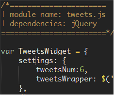
To demonstrate the concept, let’s set up a module for a twitter widget that displays the latest tweets from a twitter account on a website. It displays the first 6 tweets and offers a ability to load more tweets by way of a button.

Our Module

Let us simply call our module TweetsWidget. Normally, I would use the camel case naming convention for my variables but I will capitalise module names as it makes them stand out.

Module definition


	var TweetsWidget = {}

Configuration

To make our widget configurable and give the users more leverage we will provide some settings that can be changed to suit the users needs. Our widget module will have methods that perform different tasks. Since these methods might need access to the configurations, we will create a variable c which points to the configuration settings.

Settings

var c,
    TweetsWidget = {
	settings:{
		tweetCount: 6,
		tweetsWrapper = $('#our-tweets'),
		moreTweetsBtn = $('#tweets-btn')
	},

	/*------------
	| innitialise
	-------------*/
	init: function(){
		c = this.settings;
	}
    };

Binding widget events

Since we are adding a button for users to load more tweets if they so wish, let’s create a method that handles the UI events of our widget. Some developers may view this as unnecessary, but I think it makes our code more structured and readable. This will invoke the method that actually does the work. i.e loads more tweets.

Settings

var c,
    TweetsWidget = {
	settings:{
		tweetCount: 6,
		tweetsWrapper = $('#our-tweets'),
		moreTweetsBtn = $('#tweets-btn')
	},

	/*------------
	| innitialise
	-------------*/
	init: function(){
		c = this.settings;
		this.evntHandler();
	},

	/*---------------
	| click handler
	-----------------*/
	evntHandler: function(){
		c.moreTweetsBtn.on('click', function(){
			TweetsWidget.getMoreTweets(c.tweetCount);
		});
	},

	/*------------------------------
	| utility that loads more tweets
	----------------------------------*/
	getMoreTweets: function(num){
		//we use num as a parameter for the number of tweets we want
		//we probably use some AJAX here to avoid entire page reloads.
	}
   };

We will not write the getMoreTweets method as this is only a demonstration of how to structure our code. That’s it! We now have a module whose job is to handle the loading and displaying of recent tweets onto our site. It is evident that there is no ambiguity as to what the code does, it’s readable and maintainable. If we decide to augment our module, all we have to do is add another property to TweetsWidget and invoke the method via the init function.

What next?

We can now use another script, whose job is to load modules, to call the TweetsWidget module. This script will probably be used as a module loader as it is very likely that we will have more JavaScript on our site.

Module loader


(function(){
	
	//load tweets widget
	TweetsWidget.init();

	//load some other module
	AnotherModule.init();

})();

This is perfect on small projects. On big projects however, the number of modules can quickly get out of hand which could lead to big performance overheads and slow page load times due to the number of files being loaded. Also, you might not necessarily want some of the modules loaded into every page on your site.

To combat this, we can use a Asynchronous Module Definition loader (AMD). RequireJS is a very popular script that handles module loading very well. I am not going to go into details about AMD or RequireJS as they both deserve their own forum. I will nonetheless encourage you to check out the ‘useful resources’ section below.

Summary

The benefits of writing Modular JavaScript are clear for all to see. Some people might argue that loading several JavaScript files increases page load times. I would say that this is becoming less of a problem with modern browsers that have faster rendering and JavaScript engines. Another solution to the problem is to load your files asynchronously using tools such as RequireJS. Among other useful features that RequireJS brings to the table, is a build tool that amalgamates all your files and minifies them before serving them to the browser.

Writing JavaScript in a Modular fashion will also go a long way in nullifying the perception that JavaScript is messy, unreadable and unmanageable. If we all as developers get onto the Modular JavaScript bandwagon, then maybe, just maybe, all the naysayers might come along for the ride.

Useful resources

Saving form data using the localStorage API

HTML5 local storage

Here is a scenario that we can all relate to; You are filling in a long form and half way through, you inadvertently close the tab/window or worse still your laptop decides to crash. ‘Argh!, I was half way through that form, now I have to start again?’ comes to mind. Well, fret no more. Thanks to the localStorage API we can store form values (and more) on the fly so that in the event that the above happens, the values already entered will still be in browser memory. Storing persisting data has never been easier, and it lends itself well to enhancing user experience. I can here you say, but isn’t that a cookie? No way Jose! Sit back, relax and enjoy the ride!

What is this localStorage API thingy?

Simply put, localStorage is a JS API (commonly referred to as part of the HTML5 spec) that facilitates data storage in the browser. This is in form of key/value pairs that persist even when the user navigates away from the page. Persistence is where the similarity between localStorage and cookies ends. Not to be presumptuous, key – A name for a value to be stored. value – The value stored. Unlike Cookies,

  • localStorage does not expire, Cookies do
  • the localStorage API recommends up to 5MB, Cookies are small(approx. 4kb)
  • The localStorage API is very easy to work with as it’s simply a JavaScript object made up of key/value pairs, Cookies are messy NOTE: even if an object, the localStorage object can only store simple data types i.e strings, numbers and floating points.
  • localStorage is not sent in HTTP requests, Cookies are. This adds an overhead to your web application as unnecessary requests are made to the server.

localStorage can be accessed via the global window object and is supported in the latest iterations of all the major browsers, IE included. As a matter of fact localStorage is supported as of IE8. To test for localStorage support, simply let Modernizr (you should be using it) do the detection for you, here is how;
if(Modernizr.localstorage){
   //browser supports localStorage
}else{
   //browser does NOT support localStorage
}

You however do not have to use Modernizr to test for localStorage support. You can simply check if the window object has the localStorage property;
if(window.localStorage){
   //browser supports localStorage
}else{
   //browser does NOT support localStorage
}

but then again, Modernizr aids the detection of all the other cool progressive enhancement features, so why not take advantage.
Crash course over!

So how do I use this nice API to save form data?

As I alluded to above, the localStorage API makes working with persistent data a breeze. It’s also very easy to implement. So without further ado, here we go;

localStorage implementation

if(Modernizr.localstorage){   
    //browser supports localstorage
    $(function(){

    	//lets store input field data in a field on blur.
    	$('form').on('blur', 'input', function(){
    		//set a flag to indicate that we have saved data! 
    		localStorage.setItem('flag','formData');

    		//lets serialize the form data using jQuery's serializeArray()
    		var data = $('form').serializeArray();

    		//lets loop through the data and save the input data 
    		$.each(data, function(i, obj){
    			localStorage.setItem(obj.name, obj.value);
    		});
    	});

    	/*--------------------------------------------------------------
    	| if saved form data exists set input field values. 
    	| Note: this will naturally run before the above code 
    	| which is only triggered on the blur event.
    	--------------------------------------------------------------*/
    	if (localStorage.getItem('flag')){
    		var data = $('form').serializeArray();

    		$.each(data, function(i, obj){
    			$("[name='"+obj.name+"']").val(localStorage.getItem(obj.name));
    		});
    	}
    });

}else{

   //NO native localStorage support - resort to a fallback eg $.localStorage()

}

In the above snippet, we test for localStorage support which if successful, and after the DOM is ready, we use the blur event to trigger localStorage, calling the setItem() method in particular. This little number will create key (obj.name), value (obj.value) pairs for all input fields other than the submit button and store these as an array of objects stored in browser memory. We do this by iterating through the serialized form data. In layman talk, every time the user moves away from a field we tell the browser to store the values in the input fields.

Great! We have now stored the data, but how do we then retrieve this data? Before we retrieve the data and populate the respective fields, note that we set a flag if localStorage.setItem() has been invoked on the form data. We can then maybe alert the user that form data was saved last time they filled in the form, but we can also use this flag as a test for presence of saved data. We then serialize the form data so that we can loop through it and set the values of the input fields. Note that instead of invoking the setItem() method, we are now calling upon its sibling getItem().Voilà! Easy as pie.

Being the nice developers that we are, we can also provide a way for the user to clear the form fields if they so wish, by simply adding a button to clear input data. The click event handler for the button will be something akin to;

$(‘#clear-btn’).on(‘click’, function(){ localStorage.setItem(‘flag’,”) })

On clicking the ‘clear button’ the value of the flag will be set to empty string which is a falsey value. Consequently, when the user reloads the page, the code that sets the input values to the stored data will not execute/run.

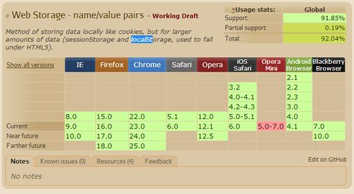
Browser support

Summary

The fact that the localStorage interface is a lot easier to use compared to the now ageing cookies, is the reason this API has had rapid adoption by many in the development community. There are many applications for localStorage but I have used persisting form data as a way of whetting your appetite and I implore you to explore this cool API further. Hopefully, this will make storing and working with client-side data a tad bit easier.

That said, localStorage should be used judiciously and users should always be made aware that their data is being stored albeit to improve user experience. Don’t forget those disclaimers!

Useful resources

PictureFill – A responsive images technique

Responsive Images

If your web application takes more than 3 seconds to load, you will soon get a call from the the latency police to explain yourself. Users expect snappy applications otherwise they will move on to the next website with better user experience. For businesses, you can not overstate the importance of fast applications as this could be the difference between success and failure. One of the reasons most web pages take a long time to load is the amount of requests made by the browser and the size of the files that need to be pre-loaded. Reducing the amount of requests, is at the core of improving user experience.

Recently in my day job, I was assigned a task of creating a prototype to demonstrate responsive images. Fishing rod in hand I headed off fishing for some new techniques. There is no shortage of server and client side techniques but I settled for PictureFill.

What is PictureFill?

PictureFill is a responsive image technique devised by Scott Jehl that makes use of the proposed picture element and media queries to serve images based on browser window size.

How does it work?

An img element is created on the fly using JavaScript based on the source and media query specified within the picture element. This prevents unnecessary overheads that are otherwise incurred by pre-loading large files, especially on small or low speed devices.

Implementation – Some code please!

Head off to the Github code repository and download the code files. The code is very well documented and includes examples. I will nonetheless give a quick run down on the html markup.

PictureFill HTML markup

<picture data-picture data-alt="big pebbles">
  <source data-src="img/pebbles_small.jpg">
  <source data-src="img/pebbles_medium.jpg" data-media="(min-width: 400px)">
  <source data-src="img/pebbles_large.jpg" data-media="(min-width: 800px)">
  <source data-src="img/pebbles_extralarge.jpg" data-media="(min-width: 1000px)">

  <!-- Fallback if no JS -->
    <noscript>
      <img src="img/small.jpg" alt="big pebbles">
    </noscript>
</picture>

In the snippet above, I use the picture element to nest all the various image sources using, well the source element. Note that I also specify the screen resolutions using media queries passed as values for the data-media attribute. The beauty here is the ability to cater for as many screen resolutions as you want.

For users with JavaScript disabled, we have a fallback image which is wrapped in noscript tags. This piece of code will not be executed by browsers running JavaScript.

Well as usually, IE demands special treatment. Using IE conditional comments we can provide a one-size-for-all image for IE8 and below as Media Queries are not supported here. For example if I wanted to serve the medium image to IE8 and below, I can nest the following inside the picture element:
<!–[if (lt IE 9) & (!IEMobile)]>
  <source data-src=”img/thumbs/pebbles_medium_thumb.jpg”></div>
<![endif]–>

If you are understandably apprehensive about using the picture element as it’s still in draft status with the w3c, you can replace the picture and source tags with the div element. Remember however to make the switch in the JavaScript as well i.e replace all the picture instances with div. My take on standards is that; they do not really mean that much if the browsers do not implement the module in question. After all users are not concerned about whether the your code is legal or not. That’s not to say that we should totally disregard semantics and standards. Word is that a few browsers have began implementing the picture/source model.

Summary

To many this might seem a very involved workaround to a problem that does not yet have a standardized solution, but until a fix comes along, this is a semantic workaround for the purist. As I mentioned earlier, there is no shortage of polyfills and workarounds in the web dev community, but this by far gets my vote.

Useful resources

  • Adaptive Images – a server side responsive images technique
  • HiSRC – a jQuery plugin for responsive images
  • Senchia.IO – cloud based service for mobile development.

Media Queries and responsive web design

Media Queries

Try viewing my site on a small device or resize your browser window, and you will notice that the page content ‘responds’ to the size of the viewport by readjusting the layout. How did you do that? you might ask. Well, I will tell you and no, I won’t have to kill you. Say hello to a fairly new paradigm that is responsive web design courtesy of Media Queries.

What are Media Queries?

As can be deduced from the name, Media Queries are a means of targeting media types by way of their characteristic features. So for example; you can define a media type e.g screen or projection and then specify a width, height, orientation or color. This gives us as developers a lot of leverage and enables us to easily and quickly optimise our web applications with minimal extra development and without resorting to ‘browser sniffing’.

Let me demonstrate.

Media queries demo

@media screen and (max-width:600px){
  #med-q-demo {
    background:#FE57A1;
  }
}
This box will turn hot pink if browser window is less than 600px

In the very trivial example above, when the browser viewport is less than 600px (including the scroll bar), the media query fires the encapsulated CSS. It doesn’t take a lot of imagination to see the power put to our disposal. Go on, you know you want to see that hot pink background; resize your browser or view this page on a small screen device.

Syntax and declaration

Media queries are declared the same way CSS is applied but can be used with JavaScript as well.

Method 1

Add a link element in the head section of your document to call an external stylesheet:
<link rel=”stylesheet” media=”only screen and (max-width:480px)” href=”small_screens.css” />
A BEST PRACTICE: Create a basic stylesheet for your mobile users first, then one for tablets and desktop users. Taking this approach means, you avoid loading large assets which affect load speeds and are bandwidth intensive on mobile devices. Then use Media Queries to load the appropriate stylesheet. I can hear you saying; but there is no support for Media Queries in IE8 and below! We can get around this by using conditional comments. This is a mobile first approach which is advocated by a growing number of web developers.

Method 2

Call an external stylesheet inside another stylesheet using the @import directive:
@import url(‘small_screens.css’) only screen and (max-width:480px)
This is however considered an anti-pattern as the rest of your CSS will stop loading while the @import file loads, which might result in the user momentarily viewing the un-styled version of your page.

Method 3

Embed the Media Queries in your stylesheet using the @media rule:
@media only screen and (max-width:480px){ /*– your CSS rules –*/ }
In cases where the application does not warrant a separate Media Queries stylesheet, you can add your query within your normal stylesheet.

Method 4

We can also use JavaScript to work with Media Queries by tapping into window.matchMedia which returns a mediaQueryList object. This object has two properties:
matches: returns a boolean on a query.
media: serialised media query list.
Here is the syntax:
var smartPhones = window.mediaMatch(‘(max-width:480px)’).matches
The simple code above will return true if the viewport size is 480px or less.

NOTE: we use the only value to hide the rule from old browsers that do not support the syntax. This is ignored by browsers that support Media Queries. We can also use not to negate the Media Query.

Media features

Media features constitute any information about the host medium e.g width, height, orientation, pixel-ratio, and pixel-ratio. Most features require a value in the expression part of the Media Query which takes the following syntactical form:
@media media and (feature:value) { CSS rules } Note that this does not always have to be the case. For instance you could just test for the presence of the feature; @media media and (feature){ CSS rules }

Width and Height

width and height refer to the width and height respectively of the rendering viewport including scroll bars on desktops. These two features can be prefixed with min- and max- as the non-prefixed variants will in most cases be too specific. A practical example would be if you wanted to add a background image for browser windows over a certain width, you would do something like this:

min-width in action

@media screen and (min-width:500px){
  body { background-image: url(bg_img.png) repeat-x;  }
}

The Media Query in the above snippet tests for browser windows that are atleast 500px to apply the background image. In real world applications it’s recommended to limit the number images loaded on smartphones and tablets as they affect page load speeds and users’ bandwidth. The above technique lends itself to this. You could also use other techniques such as responsive images.

Device-width and height

This works exactly the same as the preceding example except the width is a reference to the device on which content is rendered as opposed to the browser window. As with the width feature above, device-width can be prefixed with min- and max-. This is especially useful for targeting smartphones and tablets. Let me demonstrate:

device-width

#wrapper { width:600px; }
 #wrapper div { float:left; width:290px; margin:0 10px 0 0; }
 @media screen and (max-device-width:320px){
  #wrapper { width:auto; } 
  #wrapper div { float:none; width:auto; margin:0; }
 }

In the code above, we have a wrapper div with a fixed width that contains two divs with explicit widths. This is fine for desktops but is not ideal on small devices e.g iPhones because screen real estate comes at a premium. To solve this, we use a Media Query that tests for devices with a maximum width of 320px (iPhones fall in this category), and we apply rules to remove the floats and explicit width which forces our divs to stack. View demo.

I am not going to go into details about all the Media Features but here is a list of some and what they do:

  • Orientation : used to optimise pages based on whether the device is in a horizontal orientation (width greater than height) or vertical orientation (height greater than width). @media media and (orientation:value) { CSS rules } This Media Feature is best suited for controlling content display on handheld devices.
  • Aspect ratio : Tests width-to-height ratio@media media and (aspect-ratio:ratio) { CSS rules }

Multiples

You can test for more than one Media feature on a media type. Take an example where you wanted to test for tablets in a horizontal orientation. This is the syntax:
@media only screen and (min-device-width:768px) and (max-device-width:1024px) and (orientation:horizontal) { CSS rules }

In a nutshell

Building responsive web applications is undoubtedly the future of web development. More people than ever before are viewing content on the go thanks to ever faster network speeds on tablets and smartphones. It is on this premise that as web developers we must move away from the mindset of building applications that only target a given resolution.

The Media Queries module has Candidate Recommendation status and therefore considered ready for implementation.

Modernizr

Modernizr

Since jQuery broke onto the scene, which now seems like a century ago, JavaScript libraries have become ubiquitous. Even the biggest fan must admit we are reaching saturation point. That said, there is a gem of a library that every developer must add to their toolbox; this little number goes by the name Modernizr.

What’s the fuss?

Mordernizr was originated by Faruk Ateş but has since got some heavy weights on board such as Paul Irish, and Alex Sextion. Based on the principles of progressive enhancement and graceful degradation, Modernizr detects browser support for the latest web technologies specifically HTML5 and CSS3 features including opacity, canvas, box shadow, svg, HTML5 input types, local and webStorage, geolocation and much, much more. This aids the developer in enhancing their web applications by providing useful information on support of a given web technology without resorting to the generally bad practice of user-agent(UA) sniffing. Conversely, if a certain feature is not supported, Modernizr will enable the developer to target a particular browser by providing a ‘hook’ in the DOM.

So how does it work?

Modernizr adds a CSS class to the root of the htmlelement of your document. So for example if I were working with canvas, it would add a canvas class where this technology is supported and no-canvas where it isn’t. I can then deal with both scenarios accordingly.

Saying that Modernizr is just a feature detection library is however selling it short. It can also be used to conditionally load scripts, build custom tests, and test media queries as I will demonstrate later. In the meantime here is a quick illustration of what Modernizr brings to the table.

Applying canvas using feature detection

No, that is not an image. In the trivial example above, we test for canvas support in the host browser before creating a canvas element and drawing a simple line. If you view this page in a browser that does not support canvas, you will get a friendly message encouraging you to upgrade your browser. In a real application, you might opt for a polyfill as a fallback solution for non-supporting browsers.

So how do I use it?

Modernizr is easy to use.

Step 1: Get a copy of Modernizr

Head off to modernizr.com and grab yourself a copy of the latest version of the Modernizr. You can download the full copy of the library, but chances are you only need a ‘diet’ version. In which case, the site provides a very handy tool that allows you to customize your download.

Step 2: Add to page

Script in hand, lets create a regular html document and add the Modernizr script to the page as we would any other script. Also add a ‘no-js‘ class to the html element. This will be replaced with ‘js‘ if Modernizr is running, but its also a cue to cases where JavaScript is not running and allows you to handle this scenario appropriately.

Link to script

<!DOCTYPE html>
<html class="no-js">
<head>
   <meta charset="utf-8">
   <meta http-equiv="X-UA-Compatible" content="IE=edge,chrome=1">
   <meta name="viewport" content="width=device-width,initial-scale=1">
   <script src="js/mordernizr.js"></script>
   <title>Do you support flexbox</title>
</head>
<body>
   <h1>Flexbox support</h1>
   <p></p>
</body>
</html>

Voilà! We are good to go. A quick glance at DOM, we see a array of classes added to the html element and the ‘no-js‘ class replaced with ‘js‘. Of course if we only want to test support for a handful of properties/features then modernizr.com provides a tool for configuring your download.

Step 3: have fun

As of writing, canvas is not supported cross-browser so it makes a very good candidate. I will demonstrate both the CSS and JavaScript approaches.

CSS approach

.canvas #square{ 
  /*-- styles for #square element in browser with canvas suppport --*/ 
}
.no-convas #square{ 
  /*-- styles for #square element in browser with no canvas support --*/ 
}

In the above snippet, .canvas and .no-canvas CSS rules target element #square for canvas and non-canvas supporting browsers respectively. These classes are dynamically appended to the html element by Modernizr.

In the JavaScript variant, all the classes are properties of the Modernizr object making it easy to test for feature/property support.

JavaScript approach

var el = $('#square'); 
    //Set the background color based on canvas support
    Modernizr.canvas ? el.css({'backgroundColor':'#f0f'}) : el.css('backgroundColor':'#ccc'); 
}

Note: Modernizr.canvas or any other property on the Modernizr object returns a boolean (true or false). And there you have it. But we are not done yet, there is more.

Load scripts conditionally

Within Modernizr, is a small library called YepNope. This is fundamentally a resource loader that facilitates conditional loading of both JavaScript and CSS files. For example, if we wanted to load FlashCanvas (canvas polyfill) for browsers that do not support canvas, we would use Modernizr as follows:

Modernizr.load()

Modernizr.load(){
  test:Modernizr.canvas,
  nope:js/flashcanvas.js
}

YepNope will load files asynchronously or in parallel which will make our applications perform better. Be sure to read more about Modernizr.load() as it has more tricks under its sleeve. Some of the useful properties include;

  • load: loads a script or file and,
  • complete: a callback function. Analogous to success in Ajax

Testing media queries

Modernizr provides a neat way of testing media queries using JavaScript. Say hello to Modernizr.mq(). This little bad boy takes a media query as an argument and will return a boolean. For example, if we want to improve user experience on a small device by removing certain page elements from small screens, we can do the following;

Modernizr.mq()

if(Modernizr.mq("screen and (max-width:480px)")){
  //remove secondary navigation from small screens
  $('#secondary-nav').remove();
}

Summary

I hope I have managed to whet your appetite enough for you to give Modernizr a try. The library brings a lot to the table and I am sure you will at some point in your projects find it very useful. That said, tread carefully while using it especially when writing CSS. Think of a scenario where the user has turned off JavaScript (yes, people still do), or if the script does not load for one reason or another.

Useful resources

Native HTML5 datepickers with a JavaScript fallback

HTML5 Datepicker

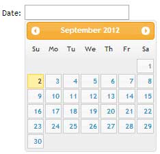
We’ve all seen them around the web. Focus in a date input field, and a calendar datepicker pops up allowing the user to select a date. Until the advent of HTML5 and jQuery UI, developers achieved this rather mean feat by way of manipulating table cells courtesy of JavaScript. Soon enough all modern browsers will natively support calendar datepickers. As a developer all you need to do is add type=”date” to your input field and watch the browser do its magic.

Unfortunately, not all browsers at the time of writing (AHEM, no name calling) support this attribute value. I will therefore make an attempt at saving the world by demonstrating how to implement a datepicker in your form fields (you can not say I did not try) while providing a JavaScript fallback for the those browsers that are yet to implement this attribute value.

The HTML

<!DOCTYPE html> 
<html> 
<head> 
   <title>HTML5 datepicker</title> 
</head> 
<body> 
   <form action=""> 
      <input type="date" name="date"> 
   </form> 
</body> 
</html>

In the HTML markup above, we have a simple input field with type=”date”. date is one of an array of new form input attribute values in the HTML5 specification. Try this out in Chrome, Firefox and Opera, and you get a calendar datepicker when the input field is in focus. This is however not the case for Internet Explorer 9 and below.

Show some mobile device love

Mobile browsers, native or otherwise, support most if not all the new HTML5 form input attribute values. This enhances the user experience as the on-demand virtual keyboard provided is appropriate to the input field in focus. So for example; if the input field has type=”email”, you are presented with a keyboard with symbols associated to email addresses e.g @ and the top level domain(.com) in some cases. But I digress, the whole chapter of HTML5 form input attributes warrants its own forum (watch this space).

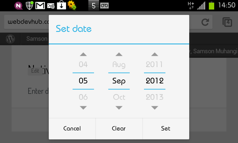
In our case, the user is presented with a calendar datepicker. The image below is a screen grab from Chrome on a Android device. Splendid indeed eh?
Chrome for Android datepicker

Fallback – Hello IE and such!(Not so much love)

The beauty of the new HTML5 elements and attribute values is that if they are not supported by the browser, they fail silently or defaults are used. In our case, IE just treats it as if it were a text input (type=”text”). However since we do not want to be sued by our friends that refuse to update their browsers or choose to use Internet Explorer, we should strive to offer a similar user experience where humanly possible or degrade gracefully. JavaScript to the rescue. Below is the revised HTML code.

Revised HTML

<!DOCTYPE html>
<html>
<head>
   <title>HTML5 datepicker</title>
   <link rel="stylesheet" href="css/ui-lightness/jquery-ui-1.8.23.custon.css">
</head>
<body>
   <form action="">
      <input type="date" name="date">
   </form>
</body>
<script src="js/jquery-1.8.1.min.js"></script>
<script src="js/jquery-ui.js"></script>

//call the datepicker method on the date input field
<script>
   $('#date').datepicker();
</script>
</html>

jQuery has a user interface library with several ready-to-use plugins/widgets that are easy to implement and make adding common features such as tabs and accordions a breeze. It so happens that the UI includes a calendar datepicker widget that we can use in this case. To add the widget to your web application, stop over at jQuery UI where you will find a demo and documentation. jQuery provides an assortment of themes and you are bound to find one that suits your project.

Once you have decided on a theme, download the library. Be sure to customise your download by deselecting all first, then only adding core jQuery and the datepicker widget as you do not need the entire UI library. Do not forget to choose a theme before you click the download button otherwise your color picker will not have the CSS to your theme of choice.

As you may have noted in the revised HTML code above, I have added the jQuery UI script which has a dependency on jQuery core. I have also added the CSS that will give our datepicker the preferred theme/styling. You are now ready to apply the functionality to your input field.

Now simply call the datepicker method on the #date input field as demonstrated in the code above. You should obviously do this ‘unobstrusively’ by creating an external file, but for expedience and conciseness I have added the code at the bottom of the HTML file. And there it is folks, easy as pie, we have a cross browser datepicker. Yes, it works in IE too. Who knew?

There is however one problem, if you try out our new input field in a browser that supports this feature natively, you will notice that we are getting both the native and the jQuery plugin fallback solution, which is obviously not elegant. To solve this problem, we can add simple feature detection to our code to test weather the browser supports the date attribute value or not.

In the snippet below, we create an element and assign date to the type attribute, if the browser does not understand this value, it coerces the value to text. We then test whether our #date input type is text, if so, only then should we add the fallback. See code below and check out the demo;

Feature detection

<script>
   var el = document.createElement('input');
   el.setAttribute('type','date');
   //if type is text then and only then should you call the fallback
   if(el.type === 'text'){
      $('#date').datepicker({
         dateFormat:'dd-mm-yy'
      });
   }
</script>

Properties

The datepicker method can take an object as a parameter with an array of properties such as dateFormat, autoSize, minDate, maxDate that you can pass to customize the behaviour. For a definitive list, visit the demo URL above and click on options. For instance to set the date format, you would pass dateFormat:’dd-mm-yy’ as shown below

Change date format

<script>
  $('#date').datepicker({
   dateFormat:'dd-mm-yy'
  });
</script>

To wrap it up, I would recommend another very nice calendar plugin that I have used in the past by Andy Croxall of the mitya.co.uk fame. Feel free to give it a try.

That’s a wrap.