 Ask any front-end developer what they have in their armoury for laying out pages, and you are sure to get the following 3 musketeers: float, margin, and position. But move over boys, there is a new Sheriff in town and he goes by the name Flexbox.
As CSS moves into its third iteration, a range of new cutting edge toolsets have been proposed to the World Wide Web consortium w3c. Amongst these modules is The Flexible Box Layout.
What is Flexbox?
Flexbox gives elements fluidity which in turn allows them to change position in relation to their siblings or parents. This means you do not have to explicitly specify position or carry out complex calculations to for instance; center an element vertically and horizontally inside its parent. The eagle eyed amongst you can see the immediate advantages of this model.
At the time of this writing, there is a plethora of devices on which people view web pages. Consequently, it is fast becoming difficult to build pages that render appropriately to the wide and ever growing range of screen sizes and devices. Flexbox gives your designs the flexibility and fluidity needed for modern web pages to adjust accordingly.
Applying Flexbox
Applying Flexbox to a given element requires that you specify a parent or child within it. For example if you have a paragraph nested in a div, you have to give the display property of the div a value of box. This is a new value for the display property in CSS3
Applying Flexbox:
elem { display:box }
Setting this declaration on an element renders all its immediate child elements subject to Flexbox. Remember this is still a recommendation and must be used with the various vendor prefixes. i.e -moz-box, -ms-box and -webkit-box.
Practical illustration
The HTML
<!DOCTYPE html>
<html>
 <head>
   <title>Flexible Box layout</title>
 </head>
 <body>
   <h3>Flexbox model</h3>
   <div id="container">
     <div class="flex"></div>
     <div class="flex"></div>
     <div class="flex"></div>
   </div>
 </body>
</html>
In the contrived HTML markup above, I have three DIVS (class =’flex’) that are nested in a DIV (id=’container’). And now the CSS
The CSS
  #container { display:box; width:450px; background:#c0ffee; }
  .flex { width:150px; height:150px; border:1px solid #f0f }
Running the above code in Chrome, Firefox or Opera (remember to add the respective vendor prefixes) will align the DIVS with class flex next to each other horizontally (more about IE later). For the impatient amongst you, check out the Flexible Box model demo. Note that we don’t have any floats or position rules in sight. You will however notice that the three DIVs overlap the parent and this is because the combined width including the margins and borders, exceed the width of parent. Despair not fellow developer because Flexbox Model provides a range of properties for this and many other issues that have proved rather tricky up to now.
To fix the overflow issue, the Flexbox spec provides box-flex which takes a number for a value. The value will act as the ratio to which the child elements are resized dynamically to fit inside the parent i.e if the combined values are greater than the parent and in cases where the values are less than the parent. So in our case, we will modify the CSS by adding this property to the child elements as shown below:
box-flex
  #container { display:box; width:450px; background:#c0ffee; }
  .flex { box-flex:1; width:150px; height:150px; border:1px solid #f0f }
By setting the box-flex property, you trigger them to be flexible. This property is at the heart of the Flexible Box Model module. Until now, we’ve achieved this by making adding the combined values of border, padding, margin and then deducting them from the parent width, and then dividing the remainder by 3 in our case.
The box-flex property can take any value 0 or greater. Say for example, you want the second div wider than the other 2 (this is typical in layouts where you have two sidebars either side of the main content box), you would assign the second box a flex-box value greater than 1. This value represents the ratio by which the second box should be greater than the other two.
As I alluded to earlier, the Flexbox spec comes with a handful of properties that allow us to achieve tasks that up to now have proved problematic. I will not go into details about each and every one of them, but rather itemise and briefly state use of a few that you will find handy in your day to day projects.
- elm { box-flex-group: value } : takes a number and creates groups that can be resized together.
- elm { box-orient : value } : takes either vertical or horizontal values. This property allows you to specify how the elements should be resized. Passing vertical will resize the elements to fill the parents height and horizontal will have to opposite effect.
- elm { box-direction : value } : the value can be either normal or reverse. This allows you to set the order of elements without resorting to JavaScript. Normal is self explanatory, while reverse sets the order of the elements in the opposite direction to how they are placed in the DOM.
- elm { box-align : value } : values accepted are start, center or end. This property allows you to align the elements top, center and bottom respectively within the parent. I don’t know about you but, having to vertically center elements has always been tricky business for me and this property makes it a breeze.
- elm { box-pack : value } : takes justify or center. Justify will align the first child of an element to the beginning and the last child to the end leaving any extra space between them in the middle. center will place the element in the center of its parent and distribute the extra space horizontally on either side. Combining box-pack and box-orient gives you a vertically and horizontally centered element without specifying heights and or calculating margins.
Implementation across browsers
Internet Explorer has built a reputation of coming fashionably (or NOT depending on who you ask) late to the party. Not to disappoint, Microsoft have done it again. The Flexible Box Model is implemented to a certain degree in all browsers (be it with vendor prefixes) bar IE9 and below.
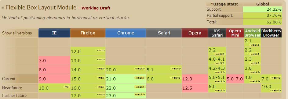
That said, the implementation of the Flexible Box Module is still inconsistent across browsers and has a working draft status. See table below provided by caniuse.com. This however should not deter you from using some of the properties be it judiciously.
Thanks to a clever script called flexie, you can get this module to work consistently across all browsers. This script will detect whether the browser natively supports Flexbox, and if not simulate the properties. To get this script to work is super easy. Just call the script in the head section as you would any other script and be sure to add the nonprefixed properties in your CSS. e.g
Flexie CSS
elem {
  -webkit-box-orient : horizontal;
  -moz-box-orient : horizontal;
  -ms-box-orient : horizontal;
  box-orient : horizontal
}
Summary
The Flexible Box Model looks to move all of us forward from the not so elegant use of floats, margins and position to layout our pages. This module is currently a recommendation by the W3C and is not definitively bound to become a candidate. That said, if all the browsers implement it then weather it becomes a candidate or not is to a degree immaterial.
At the time of this writing, implementation still looks patchy but with time this will become the standard, so you might as well get your hands dirty now, so to speak. See demo