HTML5 – Link and DNS prefetching

link and dns prefetching

In a world where instant gratification is paramount, it is imperative that our web applications are optimized for speed and performance. HTML5 has two features that many developers are unaware of, namely prefetch and prerender. ‘Excuse-moi?’ I hear you say. Well maybe not in French, but you know what I mean. Let me elaborate.

Link prefetching and prerendering

The prefetch HTML5 feature allows the developer to silently fetch a page or asset as soon as the page loads. This page or asset will therefore instantly load when the user makes the request via a designated link. This feature only fetches that exact specified resource (URL).

Content prefetching and prerendering can be invaluable in dramatically speeding up your website by shaving off valuable milliseconds on http latency.

This dramatically improves load speeds of your pages and is especially useful for mobile applications.

Prerender on the other hand will render the whole page in the background albeit with some limitations. Use these features sparingly however, as over use can prove counter productive (Well, like anything in life, too much of anything is…). Only prerender pages that are likely to be visited by the user. And the code? In the head section of your web page, add the following code replacing the href values with your own.

Prefetch and Prerender examples


<link rel="prerender" href="http://www.webdevhub.co.uk/about-me.html" />
<link rel="prefetch" href="http://www.webdevhub.co.uk/assets/my_logo.png" />

Adding the code above to the head section will prerender the about-me.html and prefetch my_logo.png in the background as soon as the page loads making those two items available as soon as they are requested. Since a round trip to the server is not required when the user clicks on the about me link, the page will load almost instantaneously.

DNS Fetching

In order to reach a given hostname, the browser needs to do some work to resolve the underlying domain or DNS. This has a speed overhead. DNS prefetching allows you to manually specify which domains to prefetch and here is the magic:

DNS prefetching


<link rel="dns-prefetch" href="http://www.asp.net/ajaxlibrary/cdn.ashx" />
<link rel="dns-prefetch" href="//ajax.googleapis.com/ajax/libs" />

In the code above we are explicitly telling the browser to resolve the two domains. This is all done in the background unobtrusively and in turn improving HTTP latency.

Google uses prefetching on its results page to provide instant pages. As soon as you enter your search query and Google is fairly certain of what you are looking for, it starts prerendering the pages using the techniques above. So when you click on any of the results, the page appears to load almost instantaneously.

Support and implementation of the above features is still in flux but, here is a simple guide to follow;

Chrome

prerender – resolves DNS, loads URL, loads whole page.
DNS-prefetch – resolves DNS.

Firefox

prefetch – resolves DNS, loads URL
DNS-prefetch – resolves DNS.

IE9+

DNS-prefetch – resolves DNS.

If you want to prerender a page in browsers that support this feature (Chrome), and prefetch in other browsers (Firefox and IE9+), you can pass both features in the rel attribute.
  <link rel=”prefetch prerender” href=”…” />

In conclusion, patchy support should not stop you from using these and other HTML5 features in your projects, as long as you provide a fall back where possible for browsers that do not support a given feature.

Happy coding!

The HTML5 datalist element

html5 datalist

I speak for many a developer when are I say that until recently, web forms were one of the most mundane and uninspiring elements of a web page. As a matter of fact, I had disdain for creating and using web forms. But thanks to an array of HTML5 form attributes, input types and elements this is no longer the case. In this post I am going to focus on the datalist element.

The datalist element enables you as a developer to provide a predefined list of values to the user as well as allowing them to enter their own. The datalist element is used with an input element using the list attribute, to link it to the datalist. For example;
<input value=”” list=”fruits” />
<datalist id=”fruits”></datalist>

The list attribute above links the input field to the datalist via the datalist id, in this case id=”fruits”.

You can then nest options inside the datalist element. Let’s have a look at a handful of examples.

input[type=text]

For text input fields, the datalist element allows us to set a predefined list analogous to a drop down list. The user is however not limited to the predefined list items. Unlike the drop down list, the user can still enter items not on the list, as I illustrate in the demo below.


here is the code;

<input type="text"  list="editors" />
<datalist id="editors">
  <option value="Notepad++" />
  <option value="Sublime Text" />
  <option value="Dreamweaver" />
  <option value="Coda" />
  <option value="e-texteditor" />
  <option value="Vim" />
  <option value="UltraEdit" />
</datalist>

input[type=date]

Most modern browsers handle the date input field well. datalist takes it that one step further by allowing you to add suggested dates and specify labels.


<input type="date"  list="dates" />
<datalist id="dates">
  <option value="Christmas day">2013-12-25</option>
  <option value="Labour day">2013-05-01</option>
  <option value="Birthday">2013-11-26</option>
</datalist>

input[type=range]

If you are not familiar with range input type, it allows the user to pick a value from a given range. You can extend this with our new found friend datalist, by setting predefined markers of values for the user to pick from.

0


<input type="range" value="0" min="0" max="90" list="ranges" id="range" />
<output for="range" >0</output>
<datalist id="ranges">
  <option>0</option>
  <option>15</option>
  <option>30</option>
  <option>45</option>
  <option>60</option>
  <option>75</option>
</datalist>

input[type=color]

This is another HTML5 input field that allows the user to select a colour from a colour picker. The datalist element can be used to provide a predefined list of colours.


<input type="color" value="#000000" list="colours" />
<datalist id="colours">
  <option >#c0ffee</option>
  <option >#bada55</option>
  <option >#0ff1ce</option>
  <option >#b00b00</option>
  <option >#deface</option>
</datalist>

input[type=week]

Akin to the date input field, the week input type allows the user to pick weeks rather than days. With the help of datalist, we can again give the user a list of weeks to pick from.


<input type="week" list="weeks" />
<datalist id="weeks">
  <option label="14th Week of 2013" >2013-W14</option>
  <option label="15th Week of 2013" >2013-W15</option>
  <option label="25th Week of 2013" >2013-W25</option>
  <option label="52nd Week of 2013" >2013-W52</option>
  <option label="30th Week of 2013" >2013-W30</option>
</datalist>

Conclusion

I hope that gives you an insight in the datalist element. There are more input field types that can be linked to datalist element. I have only scratched the surface above to demonstrate its use.

Unfortunately, support for input types introduced in HTML5 is sparse, especially by Internet Explorer, where even IE10 has only implemented a handful of them. Since the datalist element is inextricably linked to input fields, you will find usage is currently limited. This however doesn’t mean you shouldn’t use these new funky elements as long as you have provisions (gracefully degrade) for unsupported browsers.

Useful resources

HTML5 Geolocation API – The basics

html5 geolocation api

Location, location, location. No, I am not writing about real estate but rather a new HTML5 API that empowers developers by giving them the ability to get the geographical location of a user. In this post, I will cover the basics of the API – mainly how to get started – and I have also put together a demo to boot. The demo shows your approximate current location.

Geolocation makes the user’s location co-ordinates available to JavaScript which can then send them back to the server. This information can then be used by the developer to personalize user experience and tailor content for the end user based on location. Many retail sites, for example, tap into the geolocation API in conjunction with the Google maps API to show the user a nearby store.

Note: The browser or device must get express permission from the user before disclosing their location.

All modern user agents, otherwise known as browsers, have implemented the API, albeit the implementation is still in flux. The browser or device must get express permission from the user before sending their location co-ordinates, which comes as a relief to many users who would rather not share their location with a web site or application.

Get current position

In its simplest form, the geolocation function is;
function getLocation(){
        navigator.geolocation.getCurrentPosition(showMap)
}

Unfortunately, since the API is not implemented across all browsers at the time of this writing, we have to make provisions for antiquated browsers. This is where a really handy feature detection library called Modernizr (If you are not using it, you should) comes to the rescue. We can use Modernizr to test for geolocation support, providing a fall back where the API is not supported. Let’s rewrite the above code;
function getLocation(){
  if(Modernizr.geolocation){
     navigator.geolocation.getCurrentPosition(showMap)
  }else{
    //no support, provide a fallback. Maybe
   }

}

What happens behind the scenes

Remember for the browser to send the user’s location, the user must grant permission. So when you call getCurrentPosition() method the following happens;

  • The user will get a prompt alerting the user of the fact that the website wants to know their location
  • The prompt will request the user’s consent to share their location
  • The method is ‘blocking’ so the website cannot bypass it

Below is an example of a prompt you get in Chrome;

Getting the user’s co-ordinates

If the user consents to sharing their location, the callback (I have called mine showMap) will fire. The callback takes one argument which is an object that contains both the coordinates and a timestamp. Let’s write the showMap function;
function showMap(position){
  var latitude = position.coords.latitude;
  var longitude = position.coords.longitude;
//we can place the map on the canvas
}

The position object passed as a parameter in the showMap function consists of the following properties;

  • coords.latitude – degrees
  • coords.longitude – degrees
  • coords.altitude – meters
  • coords.accuracy – meters
  • coords.altitudeAccuracy – meters
  • coords.heading – degrees clockwise
  • coords.speed – meters per second
  • timestamp – similar to the Date() object

Now, working on the premise that geolocation works on a opt-in basis, we have to be prepared for some error-handling in the event that the users decides not to share their location. The second argument to our getCurrentPosition() method, is the error handling callback. So let’s update our function to that effect.
navigator.geolocation.getCurrentPosition(showMap, errHandler)

If there is a problem, the errHandler() callback will fire. The error handler has a PositionError object which is one of the following;

  • PERMISSION_DENIED(1) – The user has denied you access to their location
  • POSITION_UNAVAILABLE(2) – The network is down
  • TIMEOUT(3) – It took too long to calculate the user’s position

Above codes in hand, we can handle all three cases as we see fit. For example, if the user opts not to share their location, our error handler would be something like;
function errHandler(err){
  if(err.code == 1){
    //user said nada
  }
}

The getCurrentPosition function takes a third optional argument called PositionOptions. This is an object with three properties namely; enableHighAccuracy, timeout and maximumAge. As you can deduce from their names, enableHighAccuracy provides as an accurate a result as possible. If set to true, this might however result in a slower response. Timeout is the number of milliseconds your application is willing to wait for a calculation, and maximumAge allows the application to use a cached position within a specified time frame. I illustrate one of the three optional properties below;
navigator.geolocation.getCurrentPosition(showMap, errHandler, {maximumAge:85000})

Cross browser support

Most modern browsers including IE9 and above support geolocation natively. However, if you are still supporting legacy IE (IE8 and below) do not despair. Help is at hand in the form of geoposition.js.

Geoposition.js

Geoposition.js is a geolocation polyfill that not only simulates the functionality in legacy IE, it also standardizes implementation across the numerous platforms, mobile included. To use the library, simply download the script from github and call it from within your document. Remember it is a best practise to add your scripts at the bottom of the body section even though technically, you should add them to the head section. While scripts are loading, they will stop the rest of the page from loading (also referred to as blocking). By adding them to the bottom of the page, you avoid this.

non-blocking geoposition script tag

<!doctype html>
<html>
<head>
  <title></title>
</head>
  <body>

  <script src="js/geoPosition.js"></script>
  </body>
</html>

Once you have the script in place, you are now ready to use geolocation with assurances that it will work cross browser and cross platform.

Implementation

To initialize geolocation, do the following;
if(geoPosition.init()){
  geoPosition.getCurrentPosition(successCallback, errCallback, {enableHighAccuracy:true})
}else{
  //geolocation is not available on this device or browser
}

We can now write the succesCallback and errCallback functions.

Success callback

function successCallback(p){
  //p : the the geolocation object as the passed argument
  //p.latitude : the latitude value
  //p.longitude : the longitude value value
}

Error callback

function errCallback(p){
  //p.message : the error message
}

The API is well documented on github, so if you are interested in all the bells and whistles, read the documentation.

Demo

To quickly demonstrate geolocation, if the user’s browser or device supports geolocation, I have added a simple link to this page and attached a click event listener. When the user clicks the link, the geolocation function is called and the magic happens. Otherwise, I simply display a “your browser doesn’t support geolocation” message. GIVE IT TRY!

Note: Remember to drop in at the google developers page to grab an API key which you will need use google maps in your projects.

That’s it people.

Useful resources

PictureFill – A responsive images technique

Responsive Images

If your web application takes more than 3 seconds to load, you will soon get a call from the the latency police to explain yourself. Users expect snappy applications otherwise they will move on to the next website with better user experience. For businesses, you can not overstate the importance of fast applications as this could be the difference between success and failure. One of the reasons most web pages take a long time to load is the amount of requests made by the browser and the size of the files that need to be pre-loaded. Reducing the amount of requests, is at the core of improving user experience.

Recently in my day job, I was assigned a task of creating a prototype to demonstrate responsive images. Fishing rod in hand I headed off fishing for some new techniques. There is no shortage of server and client side techniques but I settled for PictureFill.

What is PictureFill?

PictureFill is a responsive image technique devised by Scott Jehl that makes use of the proposed picture element and media queries to serve images based on browser window size.

How does it work?

An img element is created on the fly using JavaScript based on the source and media query specified within the picture element. This prevents unnecessary overheads that are otherwise incurred by pre-loading large files, especially on small or low speed devices.

Implementation – Some code please!

Head off to the Github code repository and download the code files. The code is very well documented and includes examples. I will nonetheless give a quick run down on the html markup.

PictureFill HTML markup

<picture data-picture data-alt="big pebbles">
  <source data-src="img/pebbles_small.jpg">
  <source data-src="img/pebbles_medium.jpg" data-media="(min-width: 400px)">
  <source data-src="img/pebbles_large.jpg" data-media="(min-width: 800px)">
  <source data-src="img/pebbles_extralarge.jpg" data-media="(min-width: 1000px)">

  <!-- Fallback if no JS -->
    <noscript>
      <img src="img/small.jpg" alt="big pebbles">
    </noscript>
</picture>

In the snippet above, I use the picture element to nest all the various image sources using, well the source element. Note that I also specify the screen resolutions using media queries passed as values for the data-media attribute. The beauty here is the ability to cater for as many screen resolutions as you want.

For users with JavaScript disabled, we have a fallback image which is wrapped in noscript tags. This piece of code will not be executed by browsers running JavaScript.

Well as usually, IE demands special treatment. Using IE conditional comments we can provide a one-size-for-all image for IE8 and below as Media Queries are not supported here. For example if I wanted to serve the medium image to IE8 and below, I can nest the following inside the picture element:
<!–[if (lt IE 9) & (!IEMobile)]>
  <source data-src=”img/thumbs/pebbles_medium_thumb.jpg”></div>
<![endif]–>

If you are understandably apprehensive about using the picture element as it’s still in draft status with the w3c, you can replace the picture and source tags with the div element. Remember however to make the switch in the JavaScript as well i.e replace all the picture instances with div. My take on standards is that; they do not really mean that much if the browsers do not implement the module in question. After all users are not concerned about whether the your code is legal or not. That’s not to say that we should totally disregard semantics and standards. Word is that a few browsers have began implementing the picture/source model.

Summary

To many this might seem a very involved workaround to a problem that does not yet have a standardized solution, but until a fix comes along, this is a semantic workaround for the purist. As I mentioned earlier, there is no shortage of polyfills and workarounds in the web dev community, but this by far gets my vote.

Useful resources

  • Adaptive Images – a server side responsive images technique
  • HiSRC – a jQuery plugin for responsive images
  • Senchia.IO – cloud based service for mobile development.

Media Queries and responsive web design

Media Queries

Try viewing my site on a small device or resize your browser window, and you will notice that the page content ‘responds’ to the size of the viewport by readjusting the layout. How did you do that? you might ask. Well, I will tell you and no, I won’t have to kill you. Say hello to a fairly new paradigm that is responsive web design courtesy of Media Queries.

What are Media Queries?

As can be deduced from the name, Media Queries are a means of targeting media types by way of their characteristic features. So for example; you can define a media type e.g screen or projection and then specify a width, height, orientation or color. This gives us as developers a lot of leverage and enables us to easily and quickly optimise our web applications with minimal extra development and without resorting to ‘browser sniffing’.

Let me demonstrate.

Media queries demo

@media screen and (max-width:600px){
  #med-q-demo {
    background:#FE57A1;
  }
}
This box will turn hot pink if browser window is less than 600px

In the very trivial example above, when the browser viewport is less than 600px (including the scroll bar), the media query fires the encapsulated CSS. It doesn’t take a lot of imagination to see the power put to our disposal. Go on, you know you want to see that hot pink background; resize your browser or view this page on a small screen device.

Syntax and declaration

Media queries are declared the same way CSS is applied but can be used with JavaScript as well.

Method 1

Add a link element in the head section of your document to call an external stylesheet:
<link rel=”stylesheet” media=”only screen and (max-width:480px)” href=”small_screens.css” />
A BEST PRACTICE: Create a basic stylesheet for your mobile users first, then one for tablets and desktop users. Taking this approach means, you avoid loading large assets which affect load speeds and are bandwidth intensive on mobile devices. Then use Media Queries to load the appropriate stylesheet. I can hear you saying; but there is no support for Media Queries in IE8 and below! We can get around this by using conditional comments. This is a mobile first approach which is advocated by a growing number of web developers.

Method 2

Call an external stylesheet inside another stylesheet using the @import directive:
@import url(‘small_screens.css’) only screen and (max-width:480px)
This is however considered an anti-pattern as the rest of your CSS will stop loading while the @import file loads, which might result in the user momentarily viewing the un-styled version of your page.

Method 3

Embed the Media Queries in your stylesheet using the @media rule:
@media only screen and (max-width:480px){ /*– your CSS rules –*/ }
In cases where the application does not warrant a separate Media Queries stylesheet, you can add your query within your normal stylesheet.

Method 4

We can also use JavaScript to work with Media Queries by tapping into window.matchMedia which returns a mediaQueryList object. This object has two properties:
matches: returns a boolean on a query.
media: serialised media query list.
Here is the syntax:
var smartPhones = window.mediaMatch(‘(max-width:480px)’).matches
The simple code above will return true if the viewport size is 480px or less.

NOTE: we use the only value to hide the rule from old browsers that do not support the syntax. This is ignored by browsers that support Media Queries. We can also use not to negate the Media Query.

Media features

Media features constitute any information about the host medium e.g width, height, orientation, pixel-ratio, and pixel-ratio. Most features require a value in the expression part of the Media Query which takes the following syntactical form:
@media media and (feature:value) { CSS rules } Note that this does not always have to be the case. For instance you could just test for the presence of the feature; @media media and (feature){ CSS rules }

Width and Height

width and height refer to the width and height respectively of the rendering viewport including scroll bars on desktops. These two features can be prefixed with min- and max- as the non-prefixed variants will in most cases be too specific. A practical example would be if you wanted to add a background image for browser windows over a certain width, you would do something like this:

min-width in action

@media screen and (min-width:500px){
  body { background-image: url(bg_img.png) repeat-x;  }
}

The Media Query in the above snippet tests for browser windows that are atleast 500px to apply the background image. In real world applications it’s recommended to limit the number images loaded on smartphones and tablets as they affect page load speeds and users’ bandwidth. The above technique lends itself to this. You could also use other techniques such as responsive images.

Device-width and height

This works exactly the same as the preceding example except the width is a reference to the device on which content is rendered as opposed to the browser window. As with the width feature above, device-width can be prefixed with min- and max-. This is especially useful for targeting smartphones and tablets. Let me demonstrate:

device-width

#wrapper { width:600px; }
 #wrapper div { float:left; width:290px; margin:0 10px 0 0; }
 @media screen and (max-device-width:320px){
  #wrapper { width:auto; } 
  #wrapper div { float:none; width:auto; margin:0; }
 }

In the code above, we have a wrapper div with a fixed width that contains two divs with explicit widths. This is fine for desktops but is not ideal on small devices e.g iPhones because screen real estate comes at a premium. To solve this, we use a Media Query that tests for devices with a maximum width of 320px (iPhones fall in this category), and we apply rules to remove the floats and explicit width which forces our divs to stack. View demo.

I am not going to go into details about all the Media Features but here is a list of some and what they do:

  • Orientation : used to optimise pages based on whether the device is in a horizontal orientation (width greater than height) or vertical orientation (height greater than width). @media media and (orientation:value) { CSS rules } This Media Feature is best suited for controlling content display on handheld devices.
  • Aspect ratio : Tests width-to-height ratio@media media and (aspect-ratio:ratio) { CSS rules }

Multiples

You can test for more than one Media feature on a media type. Take an example where you wanted to test for tablets in a horizontal orientation. This is the syntax:
@media only screen and (min-device-width:768px) and (max-device-width:1024px) and (orientation:horizontal) { CSS rules }

In a nutshell

Building responsive web applications is undoubtedly the future of web development. More people than ever before are viewing content on the go thanks to ever faster network speeds on tablets and smartphones. It is on this premise that as web developers we must move away from the mindset of building applications that only target a given resolution.

The Media Queries module has Candidate Recommendation status and therefore considered ready for implementation.

Native HTML5 datepickers with a JavaScript fallback

HTML5 Datepicker

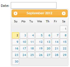
We’ve all seen them around the web. Focus in a date input field, and a calendar datepicker pops up allowing the user to select a date. Until the advent of HTML5 and jQuery UI, developers achieved this rather mean feat by way of manipulating table cells courtesy of JavaScript. Soon enough all modern browsers will natively support calendar datepickers. As a developer all you need to do is add type=”date” to your input field and watch the browser do its magic.

Unfortunately, not all browsers at the time of writing (AHEM, no name calling) support this attribute value. I will therefore make an attempt at saving the world by demonstrating how to implement a datepicker in your form fields (you can not say I did not try) while providing a JavaScript fallback for the those browsers that are yet to implement this attribute value.

The HTML

<!DOCTYPE html> 
<html> 
<head> 
   <title>HTML5 datepicker</title> 
</head> 
<body> 
   <form action=""> 
      <input type="date" name="date"> 
   </form> 
</body> 
</html>

In the HTML markup above, we have a simple input field with type=”date”. date is one of an array of new form input attribute values in the HTML5 specification. Try this out in Chrome, Firefox and Opera, and you get a calendar datepicker when the input field is in focus. This is however not the case for Internet Explorer 9 and below.

Show some mobile device love

Mobile browsers, native or otherwise, support most if not all the new HTML5 form input attribute values. This enhances the user experience as the on-demand virtual keyboard provided is appropriate to the input field in focus. So for example; if the input field has type=”email”, you are presented with a keyboard with symbols associated to email addresses e.g @ and the top level domain(.com) in some cases. But I digress, the whole chapter of HTML5 form input attributes warrants its own forum (watch this space).

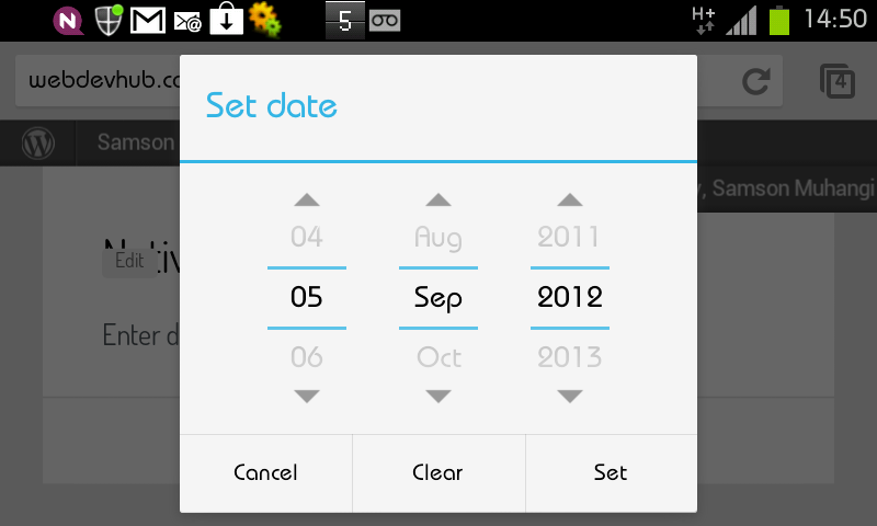
In our case, the user is presented with a calendar datepicker. The image below is a screen grab from Chrome on a Android device. Splendid indeed eh?
Chrome for Android datepicker

Fallback – Hello IE and such!(Not so much love)

The beauty of the new HTML5 elements and attribute values is that if they are not supported by the browser, they fail silently or defaults are used. In our case, IE just treats it as if it were a text input (type=”text”). However since we do not want to be sued by our friends that refuse to update their browsers or choose to use Internet Explorer, we should strive to offer a similar user experience where humanly possible or degrade gracefully. JavaScript to the rescue. Below is the revised HTML code.

Revised HTML

<!DOCTYPE html>
<html>
<head>
   <title>HTML5 datepicker</title>
   <link rel="stylesheet" href="css/ui-lightness/jquery-ui-1.8.23.custon.css">
</head>
<body>
   <form action="">
      <input type="date" name="date">
   </form>
</body>
<script src="js/jquery-1.8.1.min.js"></script>
<script src="js/jquery-ui.js"></script>

//call the datepicker method on the date input field
<script>
   $('#date').datepicker();
</script>
</html>

jQuery has a user interface library with several ready-to-use plugins/widgets that are easy to implement and make adding common features such as tabs and accordions a breeze. It so happens that the UI includes a calendar datepicker widget that we can use in this case. To add the widget to your web application, stop over at jQuery UI where you will find a demo and documentation. jQuery provides an assortment of themes and you are bound to find one that suits your project.

Once you have decided on a theme, download the library. Be sure to customise your download by deselecting all first, then only adding core jQuery and the datepicker widget as you do not need the entire UI library. Do not forget to choose a theme before you click the download button otherwise your color picker will not have the CSS to your theme of choice.

As you may have noted in the revised HTML code above, I have added the jQuery UI script which has a dependency on jQuery core. I have also added the CSS that will give our datepicker the preferred theme/styling. You are now ready to apply the functionality to your input field.

Now simply call the datepicker method on the #date input field as demonstrated in the code above. You should obviously do this ‘unobstrusively’ by creating an external file, but for expedience and conciseness I have added the code at the bottom of the HTML file. And there it is folks, easy as pie, we have a cross browser datepicker. Yes, it works in IE too. Who knew?

There is however one problem, if you try out our new input field in a browser that supports this feature natively, you will notice that we are getting both the native and the jQuery plugin fallback solution, which is obviously not elegant. To solve this problem, we can add simple feature detection to our code to test weather the browser supports the date attribute value or not.

In the snippet below, we create an element and assign date to the type attribute, if the browser does not understand this value, it coerces the value to text. We then test whether our #date input type is text, if so, only then should we add the fallback. See code below and check out the demo;

Feature detection

<script>
   var el = document.createElement('input');
   el.setAttribute('type','date');
   //if type is text then and only then should you call the fallback
   if(el.type === 'text'){
      $('#date').datepicker({
         dateFormat:'dd-mm-yy'
      });
   }
</script>

Properties

The datepicker method can take an object as a parameter with an array of properties such as dateFormat, autoSize, minDate, maxDate that you can pass to customize the behaviour. For a definitive list, visit the demo URL above and click on options. For instance to set the date format, you would pass dateFormat:’dd-mm-yy’ as shown below

Change date format

<script>
  $('#date').datepicker({
   dateFormat:'dd-mm-yy'
  });
</script>

To wrap it up, I would recommend another very nice calendar plugin that I have used in the past by Andy Croxall of the mitya.co.uk fame. Feel free to give it a try.

That’s a wrap.