Do more with LESS

LESS

If you are like me, you have probably wondered why hitherto in CSS, we have not been able to use variables, functions and other general programming good practices given its verbose nature. Most developers that write CSS are familiar with programming principles and wouldn’t it be great if these could be applied to CSS? Well, we are in luck, say hello to LESS.

What is LESS?

LESS is a syntax or preprocessor that takes CSS and applies familiar programming principles such as variables, functions, mixins (more about this little number later) and nesting. What we get, is a smarter and dynamic language for writing CSS. You can take either the client-side or server-side approach when implementing LESS. When using the client-side approach, LESS is interpreted into regular CSS by way of JavaScript at runtime.

The ability to declare variables for example, gives us a more efficient way of changing values after the fact. For instance, if we decide that we now want to change a color used on the site from cyan to hot pink, we do not have to scour the stylesheet for all the instances of cyan. All we need to do is change it at source i.e where the variable is declared. LESS also brings the benefits of utility functions to CSS, a much welcome addition. LESS derives its name from yes, you guessed it; the ability to write less CSS.

How easy is it to get the ball rolling?

Compared to the other preprocessors, compass/SASS and Stylus, both of which need Ruby installed on your machine, LESS is child’s play so to speak, when it comes to implementation for client-side usage. It takes nothing but a couple of steps to get up and running.

Step 1
Create a .less file and link to it from the head section like so: <link type=”text/css” rel=”stylesheet/less” href=”main.less” />

Step 2
For client-side usage, head off to lesscss.org, download less.js and reference it from the head section.
<script src=”js/less.js”></script>

Important: It’s imperative that the stylesheet reference is placed above the Javascript script tag.

And that’s it. You are now ready to start writing LESS.

If you are however looking for some flexibility, you can configure certain aspects and functionality on the LESS global object. You can find out more about configuration in the documentation.

For the server-side approach, it is highly recommended that you use npm. Node.js (a server-side JavaScript interpreter) provides a package manager(npm) that runs through the command-line tool. This is the best way to install and use LESS server-side. I am not going to get into details on the command-line approach, but if you are interested, there is a very good wiki on the subject on github.

Now the syntax

The LESS syntax/language is very similar to CSS. All LESS and other preprocessors do is add cool features to CSS. By way of example, I will demonstrate some of these features.

Variables

LESS variables are prefixed with a @ sign and once declared can be referenced throughout the stylesheet. We can use variables for any CSS values e.g colors, text or numbers. This is an efficient way of storing values as we only have to change them in one place as opposed to regular CSS where one has to scan through the stylesheet for all instances of the value in question.

LESS

   @bgColor:#c0ffee;
   @fontSize:12px;
   @borderStyle:dashed;
   @borderColor:#f0f;
   div{ 
      width:150px; 
      height:150px; 
      background:@bgColor; 
      border:1px @borderStyle @borderColor; 
   }

here is the CSS after compilation:

COMPILED CSS

   div{
      width:150px;
      height:150px;
      background:#c0ffee;
      border:1px dashed #f0f;
 }

So, if we decide to change #c0ffee to #bada55, we only have to change the value of @bgColor(declaration) and all the instances of @bgColor within the stylesheet will be dynamically updated.

Mixins

Mixins are akin to functions in that they are blocks of code that can be invoked anywhere within the stylesheet. They can accept arguments similar to functions in other programming languages – say, JavaScript. A very good use case scenario is vendor prefixes. In many cases we find ourselves repeating vendor prefixes for features that are not yet supported in some browsers.

Using a mixin can make this more dynamic and efficient as I demonstrate below.

LESS

.border-radius(values){ 
-webkit-border-radius:$values; 
-moz-border-radius:$values; 
   border-radius:$values; 
}
div { .border-radius(10px); }

Now whenever we want to add rounded corners to an element, we just call our new border radius mixin and pass in a value. Here is the *compiled CSS;

COMPILED CSS

   div{ 
      -webkit-border-radius:10px; 
      -moz-border-radius:10px;
         border-radius:10px;
   }

Imagine what we can do with this feature! For instance you could create a mixin with default values or pass your desired value at invocation. Here is another example;
//create a mixin that accepts an optional background color
.flag(@bgColor:”#cf0″){ background-color:@bgColor }
//apply styles from the mixin above
.highlight { .flag(); border:1px solid red; }
//or pass in a different color
.highlight2 { .flag(‘#333’); }

Color functions

Color functions are some of the built-in functions that come with LESS. They give us the ability to create variations of a single color. A good use case scenario is when you want to create gradients or hover colors. In the snippet below, I dynamically generate a link hover color using the darker color function;

LESS color function

@color:#c0ffee;
a { color:@color; }
a:hover { color:darken($color, 25%); //the hover link will compile to 25% darker than @color } 

Other color functions include;

  • lighten – lightens @color by a specified percentage
  • saturate – compiles to a more saturated color
  • desaturate – does the opposite of saturate
  • mix – returns a mix of two colors

LESS has many more built functions that can do much more. Refer to the LESS documentation for more.

Nesting

If you are familiar with the CSS cascading principle, you will know that it leads to a lot of repetition. Say for example;
#main { color:#f0f; }
#main .first { color:#c0ffee; }
#main a { text-decoration:none; }
#main a:hover { tex-decoration:underline; }

LESS alleviates this repetitiveness by introducing nesting. We can re-write the above code as follows;

Nesting in LESS

#main { 
  color:#f0f;

  .first{
    color:#c0ffee;
  }
  a{
    text-decoration:none;
    &:hover{ text-decoration:underline; }
  }
}

Note the use of the ampasand(&) for pseudo classes. The same applies for element type selectors e.g p.warning

Operations

Yes, you read right. In LESS you can perform operations on variables and color values. Lets do some simple operations in LESS;

LESS Operations

@width: 150px;
@height: 50px;
div { 
  width:(@width + 5); //this will evaluate to 155px   
  height:(@height * 2); //this will evaluate to 100px
}

Summary

LESS is picking up traction in the web development community primarily because, by adding useful features such as variables and functions, LESS saves time. Try it in your next project and you will not be disappointed. As I mentioned earlier, Compass/SASS and Stylus are the other CSS preprocessors at our disposal but I think LESS is by the far the easiest to work with.

A word of caution: Compiling client-side has a performance overhead, especially on big projects. It’s recommended that you either use caching on compile server-side.

Note: I should point out that I have used the term ‘compile’ loosely for emphasis. Strictly speaking JavaScript does not compile, it interprets.

Useful resources

PictureFill – A responsive images technique

Responsive Images

If your web application takes more than 3 seconds to load, you will soon get a call from the the latency police to explain yourself. Users expect snappy applications otherwise they will move on to the next website with better user experience. For businesses, you can not overstate the importance of fast applications as this could be the difference between success and failure. One of the reasons most web pages take a long time to load is the amount of requests made by the browser and the size of the files that need to be pre-loaded. Reducing the amount of requests, is at the core of improving user experience.

Recently in my day job, I was assigned a task of creating a prototype to demonstrate responsive images. Fishing rod in hand I headed off fishing for some new techniques. There is no shortage of server and client side techniques but I settled for PictureFill.

What is PictureFill?

PictureFill is a responsive image technique devised by Scott Jehl that makes use of the proposed picture element and media queries to serve images based on browser window size.

How does it work?

An img element is created on the fly using JavaScript based on the source and media query specified within the picture element. This prevents unnecessary overheads that are otherwise incurred by pre-loading large files, especially on small or low speed devices.

Implementation – Some code please!

Head off to the Github code repository and download the code files. The code is very well documented and includes examples. I will nonetheless give a quick run down on the html markup.

PictureFill HTML markup

<picture data-picture data-alt="big pebbles">
  <source data-src="img/pebbles_small.jpg">
  <source data-src="img/pebbles_medium.jpg" data-media="(min-width: 400px)">
  <source data-src="img/pebbles_large.jpg" data-media="(min-width: 800px)">
  <source data-src="img/pebbles_extralarge.jpg" data-media="(min-width: 1000px)">

  <!-- Fallback if no JS -->
    <noscript>
      <img src="img/small.jpg" alt="big pebbles">
    </noscript>
</picture>

In the snippet above, I use the picture element to nest all the various image sources using, well the source element. Note that I also specify the screen resolutions using media queries passed as values for the data-media attribute. The beauty here is the ability to cater for as many screen resolutions as you want.

For users with JavaScript disabled, we have a fallback image which is wrapped in noscript tags. This piece of code will not be executed by browsers running JavaScript.

Well as usually, IE demands special treatment. Using IE conditional comments we can provide a one-size-for-all image for IE8 and below as Media Queries are not supported here. For example if I wanted to serve the medium image to IE8 and below, I can nest the following inside the picture element:
<!–[if (lt IE 9) & (!IEMobile)]>
  <source data-src=”img/thumbs/pebbles_medium_thumb.jpg”></div>
<![endif]–>

If you are understandably apprehensive about using the picture element as it’s still in draft status with the w3c, you can replace the picture and source tags with the div element. Remember however to make the switch in the JavaScript as well i.e replace all the picture instances with div. My take on standards is that; they do not really mean that much if the browsers do not implement the module in question. After all users are not concerned about whether the your code is legal or not. That’s not to say that we should totally disregard semantics and standards. Word is that a few browsers have began implementing the picture/source model.

Summary

To many this might seem a very involved workaround to a problem that does not yet have a standardized solution, but until a fix comes along, this is a semantic workaround for the purist. As I mentioned earlier, there is no shortage of polyfills and workarounds in the web dev community, but this by far gets my vote.

Useful resources

  • Adaptive Images – a server side responsive images technique
  • HiSRC – a jQuery plugin for responsive images
  • Senchia.IO – cloud based service for mobile development.

Media Queries and responsive web design

Media Queries

Try viewing my site on a small device or resize your browser window, and you will notice that the page content ‘responds’ to the size of the viewport by readjusting the layout. How did you do that? you might ask. Well, I will tell you and no, I won’t have to kill you. Say hello to a fairly new paradigm that is responsive web design courtesy of Media Queries.

What are Media Queries?

As can be deduced from the name, Media Queries are a means of targeting media types by way of their characteristic features. So for example; you can define a media type e.g screen or projection and then specify a width, height, orientation or color. This gives us as developers a lot of leverage and enables us to easily and quickly optimise our web applications with minimal extra development and without resorting to ‘browser sniffing’.

Let me demonstrate.

Media queries demo

@media screen and (max-width:600px){
  #med-q-demo {
    background:#FE57A1;
  }
}
This box will turn hot pink if browser window is less than 600px

In the very trivial example above, when the browser viewport is less than 600px (including the scroll bar), the media query fires the encapsulated CSS. It doesn’t take a lot of imagination to see the power put to our disposal. Go on, you know you want to see that hot pink background; resize your browser or view this page on a small screen device.

Syntax and declaration

Media queries are declared the same way CSS is applied but can be used with JavaScript as well.

Method 1

Add a link element in the head section of your document to call an external stylesheet:
<link rel=”stylesheet” media=”only screen and (max-width:480px)” href=”small_screens.css” />
A BEST PRACTICE: Create a basic stylesheet for your mobile users first, then one for tablets and desktop users. Taking this approach means, you avoid loading large assets which affect load speeds and are bandwidth intensive on mobile devices. Then use Media Queries to load the appropriate stylesheet. I can hear you saying; but there is no support for Media Queries in IE8 and below! We can get around this by using conditional comments. This is a mobile first approach which is advocated by a growing number of web developers.

Method 2

Call an external stylesheet inside another stylesheet using the @import directive:
@import url(‘small_screens.css’) only screen and (max-width:480px)
This is however considered an anti-pattern as the rest of your CSS will stop loading while the @import file loads, which might result in the user momentarily viewing the un-styled version of your page.

Method 3

Embed the Media Queries in your stylesheet using the @media rule:
@media only screen and (max-width:480px){ /*– your CSS rules –*/ }
In cases where the application does not warrant a separate Media Queries stylesheet, you can add your query within your normal stylesheet.

Method 4

We can also use JavaScript to work with Media Queries by tapping into window.matchMedia which returns a mediaQueryList object. This object has two properties:
matches: returns a boolean on a query.
media: serialised media query list.
Here is the syntax:
var smartPhones = window.mediaMatch(‘(max-width:480px)’).matches
The simple code above will return true if the viewport size is 480px or less.

NOTE: we use the only value to hide the rule from old browsers that do not support the syntax. This is ignored by browsers that support Media Queries. We can also use not to negate the Media Query.

Media features

Media features constitute any information about the host medium e.g width, height, orientation, pixel-ratio, and pixel-ratio. Most features require a value in the expression part of the Media Query which takes the following syntactical form:
@media media and (feature:value) { CSS rules } Note that this does not always have to be the case. For instance you could just test for the presence of the feature; @media media and (feature){ CSS rules }

Width and Height

width and height refer to the width and height respectively of the rendering viewport including scroll bars on desktops. These two features can be prefixed with min- and max- as the non-prefixed variants will in most cases be too specific. A practical example would be if you wanted to add a background image for browser windows over a certain width, you would do something like this:

min-width in action

@media screen and (min-width:500px){
  body { background-image: url(bg_img.png) repeat-x;  }
}

The Media Query in the above snippet tests for browser windows that are atleast 500px to apply the background image. In real world applications it’s recommended to limit the number images loaded on smartphones and tablets as they affect page load speeds and users’ bandwidth. The above technique lends itself to this. You could also use other techniques such as responsive images.

Device-width and height

This works exactly the same as the preceding example except the width is a reference to the device on which content is rendered as opposed to the browser window. As with the width feature above, device-width can be prefixed with min- and max-. This is especially useful for targeting smartphones and tablets. Let me demonstrate:

device-width

#wrapper { width:600px; }
 #wrapper div { float:left; width:290px; margin:0 10px 0 0; }
 @media screen and (max-device-width:320px){
  #wrapper { width:auto; } 
  #wrapper div { float:none; width:auto; margin:0; }
 }

In the code above, we have a wrapper div with a fixed width that contains two divs with explicit widths. This is fine for desktops but is not ideal on small devices e.g iPhones because screen real estate comes at a premium. To solve this, we use a Media Query that tests for devices with a maximum width of 320px (iPhones fall in this category), and we apply rules to remove the floats and explicit width which forces our divs to stack. View demo.

I am not going to go into details about all the Media Features but here is a list of some and what they do:

  • Orientation : used to optimise pages based on whether the device is in a horizontal orientation (width greater than height) or vertical orientation (height greater than width). @media media and (orientation:value) { CSS rules } This Media Feature is best suited for controlling content display on handheld devices.
  • Aspect ratio : Tests width-to-height ratio@media media and (aspect-ratio:ratio) { CSS rules }

Multiples

You can test for more than one Media feature on a media type. Take an example where you wanted to test for tablets in a horizontal orientation. This is the syntax:
@media only screen and (min-device-width:768px) and (max-device-width:1024px) and (orientation:horizontal) { CSS rules }

In a nutshell

Building responsive web applications is undoubtedly the future of web development. More people than ever before are viewing content on the go thanks to ever faster network speeds on tablets and smartphones. It is on this premise that as web developers we must move away from the mindset of building applications that only target a given resolution.

The Media Queries module has Candidate Recommendation status and therefore considered ready for implementation.

Modernizr

Modernizr

Since jQuery broke onto the scene, which now seems like a century ago, JavaScript libraries have become ubiquitous. Even the biggest fan must admit we are reaching saturation point. That said, there is a gem of a library that every developer must add to their toolbox; this little number goes by the name Modernizr.

What’s the fuss?

Mordernizr was originated by Faruk Ateş but has since got some heavy weights on board such as Paul Irish, and Alex Sextion. Based on the principles of progressive enhancement and graceful degradation, Modernizr detects browser support for the latest web technologies specifically HTML5 and CSS3 features including opacity, canvas, box shadow, svg, HTML5 input types, local and webStorage, geolocation and much, much more. This aids the developer in enhancing their web applications by providing useful information on support of a given web technology without resorting to the generally bad practice of user-agent(UA) sniffing. Conversely, if a certain feature is not supported, Modernizr will enable the developer to target a particular browser by providing a ‘hook’ in the DOM.

So how does it work?

Modernizr adds a CSS class to the root of the htmlelement of your document. So for example if I were working with canvas, it would add a canvas class where this technology is supported and no-canvas where it isn’t. I can then deal with both scenarios accordingly.

Saying that Modernizr is just a feature detection library is however selling it short. It can also be used to conditionally load scripts, build custom tests, and test media queries as I will demonstrate later. In the meantime here is a quick illustration of what Modernizr brings to the table.

Applying canvas using feature detection

No, that is not an image. In the trivial example above, we test for canvas support in the host browser before creating a canvas element and drawing a simple line. If you view this page in a browser that does not support canvas, you will get a friendly message encouraging you to upgrade your browser. In a real application, you might opt for a polyfill as a fallback solution for non-supporting browsers.

So how do I use it?

Modernizr is easy to use.

Step 1: Get a copy of Modernizr

Head off to modernizr.com and grab yourself a copy of the latest version of the Modernizr. You can download the full copy of the library, but chances are you only need a ‘diet’ version. In which case, the site provides a very handy tool that allows you to customize your download.

Step 2: Add to page

Script in hand, lets create a regular html document and add the Modernizr script to the page as we would any other script. Also add a ‘no-js‘ class to the html element. This will be replaced with ‘js‘ if Modernizr is running, but its also a cue to cases where JavaScript is not running and allows you to handle this scenario appropriately.

Link to script

<!DOCTYPE html>
<html class="no-js">
<head>
   <meta charset="utf-8">
   <meta http-equiv="X-UA-Compatible" content="IE=edge,chrome=1">
   <meta name="viewport" content="width=device-width,initial-scale=1">
   <script src="js/mordernizr.js"></script>
   <title>Do you support flexbox</title>
</head>
<body>
   <h1>Flexbox support</h1>
   <p></p>
</body>
</html>

Voilà! We are good to go. A quick glance at DOM, we see a array of classes added to the html element and the ‘no-js‘ class replaced with ‘js‘. Of course if we only want to test support for a handful of properties/features then modernizr.com provides a tool for configuring your download.

Step 3: have fun

As of writing, canvas is not supported cross-browser so it makes a very good candidate. I will demonstrate both the CSS and JavaScript approaches.

CSS approach

.canvas #square{ 
  /*-- styles for #square element in browser with canvas suppport --*/ 
}
.no-convas #square{ 
  /*-- styles for #square element in browser with no canvas support --*/ 
}

In the above snippet, .canvas and .no-canvas CSS rules target element #square for canvas and non-canvas supporting browsers respectively. These classes are dynamically appended to the html element by Modernizr.

In the JavaScript variant, all the classes are properties of the Modernizr object making it easy to test for feature/property support.

JavaScript approach

var el = $('#square'); 
    //Set the background color based on canvas support
    Modernizr.canvas ? el.css({'backgroundColor':'#f0f'}) : el.css('backgroundColor':'#ccc'); 
}

Note: Modernizr.canvas or any other property on the Modernizr object returns a boolean (true or false). And there you have it. But we are not done yet, there is more.

Load scripts conditionally

Within Modernizr, is a small library called YepNope. This is fundamentally a resource loader that facilitates conditional loading of both JavaScript and CSS files. For example, if we wanted to load FlashCanvas (canvas polyfill) for browsers that do not support canvas, we would use Modernizr as follows:

Modernizr.load()

Modernizr.load(){
  test:Modernizr.canvas,
  nope:js/flashcanvas.js
}

YepNope will load files asynchronously or in parallel which will make our applications perform better. Be sure to read more about Modernizr.load() as it has more tricks under its sleeve. Some of the useful properties include;

  • load: loads a script or file and,
  • complete: a callback function. Analogous to success in Ajax

Testing media queries

Modernizr provides a neat way of testing media queries using JavaScript. Say hello to Modernizr.mq(). This little bad boy takes a media query as an argument and will return a boolean. For example, if we want to improve user experience on a small device by removing certain page elements from small screens, we can do the following;

Modernizr.mq()

if(Modernizr.mq("screen and (max-width:480px)")){
  //remove secondary navigation from small screens
  $('#secondary-nav').remove();
}

Summary

I hope I have managed to whet your appetite enough for you to give Modernizr a try. The library brings a lot to the table and I am sure you will at some point in your projects find it very useful. That said, tread carefully while using it especially when writing CSS. Think of a scenario where the user has turned off JavaScript (yes, people still do), or if the script does not load for one reason or another.

Useful resources

CSS3 Flexible Box model

CSS3 Flexible Box modelAsk any front-end developer what they have in their armoury for laying out pages, and you are sure to get the following 3 musketeers: float, margin, and position. But move over boys, there is a new Sheriff in town and he goes by the name Flexbox.

As CSS moves into its third iteration, a range of new cutting edge toolsets have been proposed to the World Wide Web consortium w3c. Amongst these modules is The Flexible Box Layout.

What is Flexbox?

Flexbox gives elements fluidity which in turn allows them to change position in relation to their siblings or parents. This means you do not have to explicitly specify position or carry out complex calculations to for instance; center an element vertically and horizontally inside its parent. The eagle eyed amongst you can see the immediate advantages of this model.

At the time of this writing, there is a plethora of devices on which people view web pages. Consequently, it is fast becoming difficult to build pages that render appropriately to the wide and ever growing range of screen sizes and devices. Flexbox gives your designs the flexibility and fluidity needed for modern web pages to adjust accordingly.

Applying Flexbox

Applying Flexbox to a given element requires that you specify a parent or child within it. For example if you have a paragraph nested in a div, you have to give the display property of the div a value of box. This is a new value for the display property in CSS3

Applying Flexbox:

elem { display:box }

Setting this declaration on an element renders all its immediate child elements subject to Flexbox. Remember this is still a recommendation and must be used with the various vendor prefixes. i.e -moz-box, -ms-box and -webkit-box.

Practical illustration

The HTML

<!DOCTYPE html>
<html>
 <head>
   <title>Flexible Box layout</title>
 </head>
 <body>
   <h3>Flexbox model</h3>
   <div id="container">
     <div class="flex"></div>
     <div class="flex"></div>
     <div class="flex"></div>
   </div>
 </body>
</html>

In the contrived HTML markup above, I have three DIVS (class =’flex’) that are nested in a DIV (id=’container’). And now the CSS

The CSS

  #container { display:box; width:450px; background:#c0ffee; }
  .flex { width:150px; height:150px; border:1px solid #f0f }

Running the above code in Chrome, Firefox or Opera (remember to add the respective vendor prefixes) will align the DIVS with class flex next to each other horizontally (more about IE later). For the impatient amongst you, check out the Flexible Box model demo. Note that we don’t have any floats or position rules in sight. You will however notice that the three DIVs overlap the parent and this is because the combined width including the margins and borders, exceed the width of parent. Despair not fellow developer because Flexbox Model provides a range of properties for this and many other issues that have proved rather tricky up to now.

To fix the overflow issue, the Flexbox spec provides box-flex which takes a number for a value. The value will act as the ratio to which the child elements are resized dynamically to fit inside the parent i.e if the combined values are greater than the parent and in cases where the values are less than the parent. So in our case, we will modify the CSS by adding this property to the child elements as shown below:

box-flex

  #container { display:box; width:450px; background:#c0ffee; }
  .flex { box-flex:1; width:150px; height:150px; border:1px solid #f0f }

By setting the box-flex property, you trigger them to be flexible. This property is at the heart of the Flexible Box Model module. Until now, we’ve achieved this by making adding the combined values of border, padding, margin and then deducting them from the parent width, and then dividing the remainder by 3 in our case.

The box-flex property can take any value 0 or greater. Say for example, you want the second div wider than the other 2 (this is typical in layouts where you have two sidebars either side of the main content box), you would assign the second box a flex-box value greater than 1. This value represents the ratio by which the second box should be greater than the other two.

As I alluded to earlier, the Flexbox spec comes with a handful of properties that allow us to achieve tasks that up to now have proved problematic. I will not go into details about each and every one of them, but rather itemise and briefly state use of a few that you will find handy in your day to day projects.

  • elm { box-flex-group: value } : takes a number and creates groups that can be resized together.
  • elm { box-orient : value } : takes either vertical or horizontal values. This property allows you to specify how the elements should be resized. Passing vertical will resize the elements to fill the parents height and horizontal will have to opposite effect.
  • elm { box-direction : value } : the value can be either normal or reverse. This allows you to set the order of elements without resorting to JavaScript. Normal is self explanatory, while reverse sets the order of the elements in the opposite direction to how they are placed in the DOM.
  • elm { box-align : value } : values accepted are start, center or end. This property allows you to align the elements top, center and bottom respectively within the parent. I don’t know about you but, having to vertically center elements has always been tricky business for me and this property makes it a breeze.
  • elm { box-pack : value } : takes justify or center. Justify will align the first child of an element to the beginning and the last child to the end leaving any extra space between them in the middle. center will place the element in the center of its parent and distribute the extra space horizontally on either side. Combining box-pack and box-orient gives you a vertically and horizontally centered element without specifying heights and or calculating margins.

Implementation across browsers

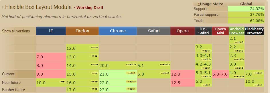
Internet Explorer has built a reputation of coming fashionably (or NOT depending on who you ask) late to the party. Not to disappoint, Microsoft have done it again. The Flexible Box Model is implemented to a certain degree in all browsers (be it with vendor prefixes) bar IE9 and below.

That said, the implementation of the Flexible Box Module is still inconsistent across browsers and has a working draft status. See table below provided by caniuse.com. This however should not deter you from using some of the properties be it judiciously.

Flexible Box model support
Thanks to a clever script called flexie, you can get this module to work consistently across all browsers. This script will detect whether the browser natively supports Flexbox, and if not simulate the properties. To get this script to work is super easy. Just call the script in the head section as you would any other script and be sure to add the nonprefixed properties in your CSS. e.g

Flexie CSS

elem { 
  -webkit-box-orient : horizontal; 
  -moz-box-orient : horizontal; 
  -ms-box-orient : horizontal; 
  box-orient : horizontal 
}

Summary

The Flexible Box Model looks to move all of us forward from the not so elegant use of floats, margins and position to layout our pages. This module is currently a recommendation by the W3C and is not definitively bound to become a candidate. That said, if all the browsers implement it then weather it becomes a candidate or not is to a degree immaterial.

At the time of this writing, implementation still looks patchy but with time this will become the standard, so you might as well get your hands dirty now, so to speak. See demo

Useful resources

Top